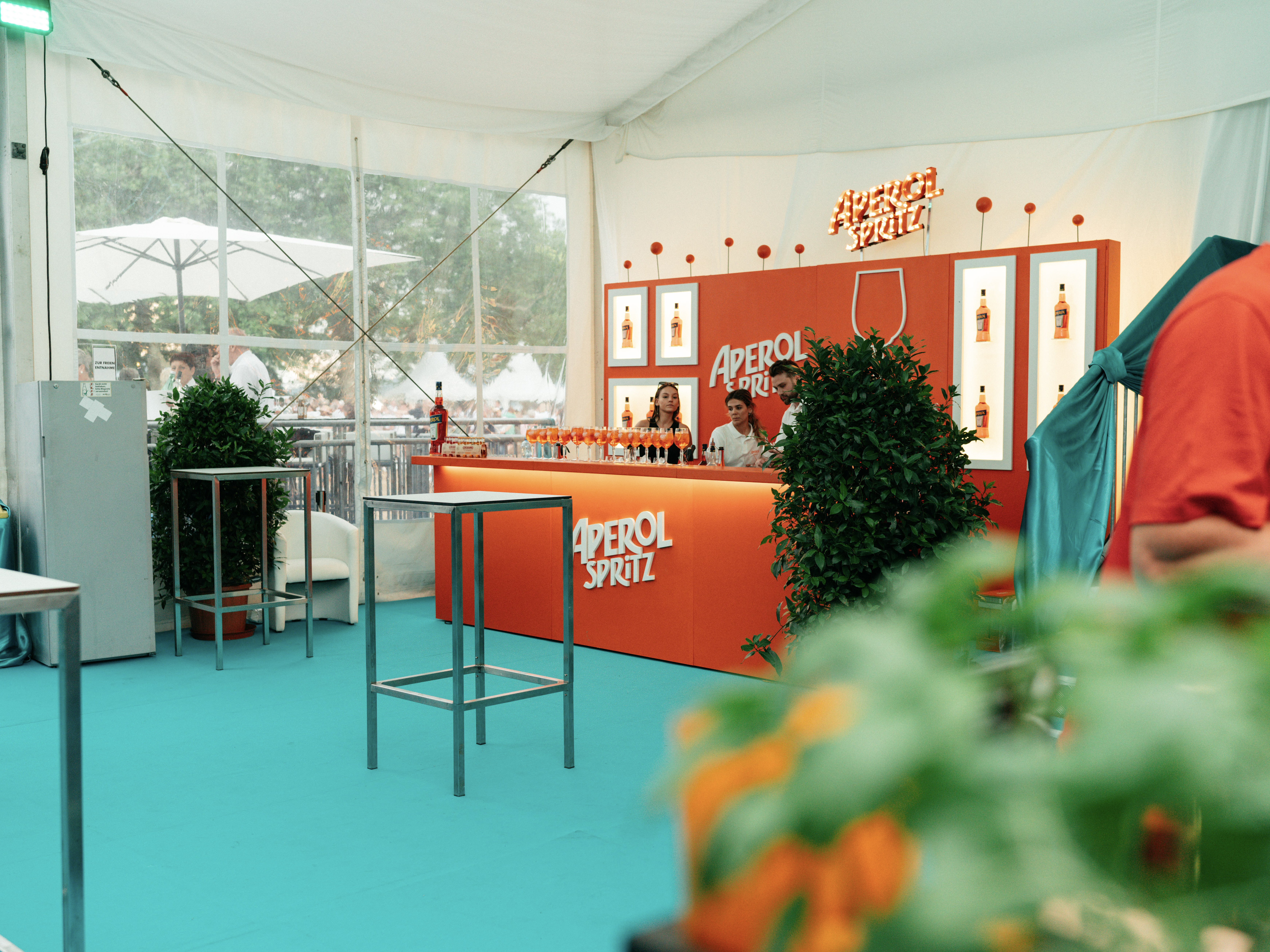
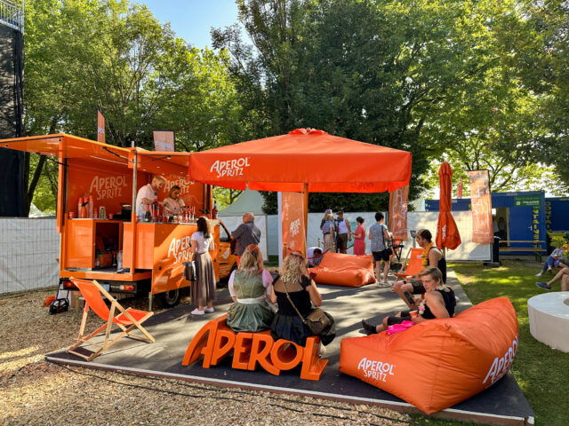
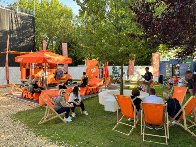
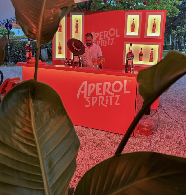
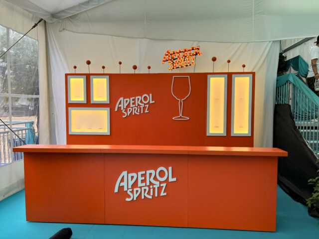
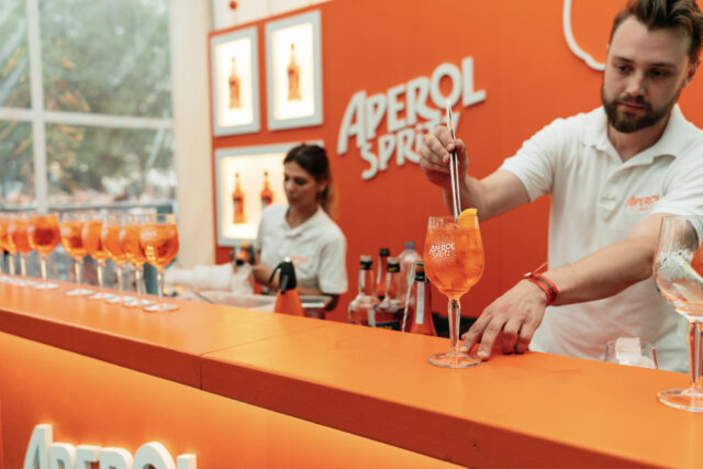
We were challenged by Aperol to reimagine and revamp an existing bar and make it fit to the new brand guidelines in a budget friendly way. Even though we normally prefer to work with our own unique mobile bar system, we accepted the challenge and set out to use as much of the existing structure as possible, whilst still ensuring the bar radiated the Aperol brand identity.
We dipped the complete bar in Aperol orange and added cut-outs of the Aperol Spritz logo to ensure the bar had the basics right. Then we added numerous details to ensure the brand is optimally presented, such as adding light boxes for bottle presentation, an Aperol Spritz glass outline to highlight the key drink, and an extra LED logo for increased visibility. The bar can be built up in many different sizes up to a width of 7 meters, but we ensured that whatever size the bar is, it looks great.
Photography: © Campari Austria (photos 5 & 6)

